Thursday, 16 April 2015
Tuesday, 14 April 2015
Audience Feedback
For our audience feedback we created a questionnaire to find out what things make a good music video to them and what they think a pop music video included. The questions we included were


- What genre of music do you like
- List some of your favourite music videos
- What do you like about these videos
- What score would you give our idea
- What features would you like to see in our video
Monday, 13 April 2015
Digipak

Digipak
Back Cover
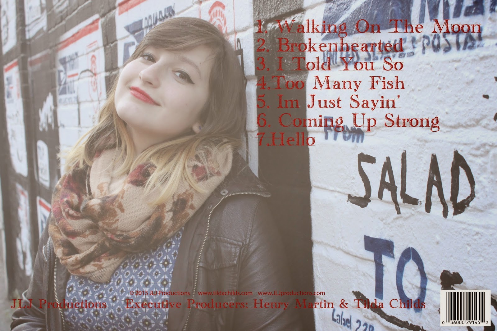
My final design for the back cover is a little simple in comparison to the front cover but it still relates as I have used the same colour for the font (red). The track list is also in simple font as when I researched digipaks I found that the back of the artists albums had very simple font for the track list as it is easy for the audience to read and is very clear. The back cover consists of everything a digipak is meant to, it includes a barcode, the recording company and the producers. I faded the original picture to make the font and track list clearer to the audience but to also give that sense of mystery so again keeping the theme with the front cover
My final design for the back cover is a little simple in comparison to the front cover but it still relates as I have used the same colour for the font (red). The track list is also in simple font as when I researched digipaks I found that the back of the artists albums had very simple font for the track list as it is easy for the audience to read and is very clear. The back cover consists of everything a digipak is meant to, it includes a barcode, the recording company and the producers. I faded the original picture to make the font and track list clearer to the audience but to also give that sense of mystery so again keeping the theme with the front cover
Digipak
Front Cover
My final digipak front cover design is based on showing the bright colours and the lipstick the artist is wearing to make her identifiable with the audience. I used this image to create a sense of mystery within the artist as to what can be expected from the album. I made the red and pink colours brighter to make them stand out and to show that the colours are in relation to the song which is about heartbreak and love which these colours represent

My final digipak front cover design is based on showing the bright colours and the lipstick the artist is wearing to make her identifiable with the audience. I used this image to create a sense of mystery within the artist as to what can be expected from the album. I made the red and pink colours brighter to make them stand out and to show that the colours are in relation to the song which is about heartbreak and love which these colours represent
Subscribe to:
Posts (Atom)