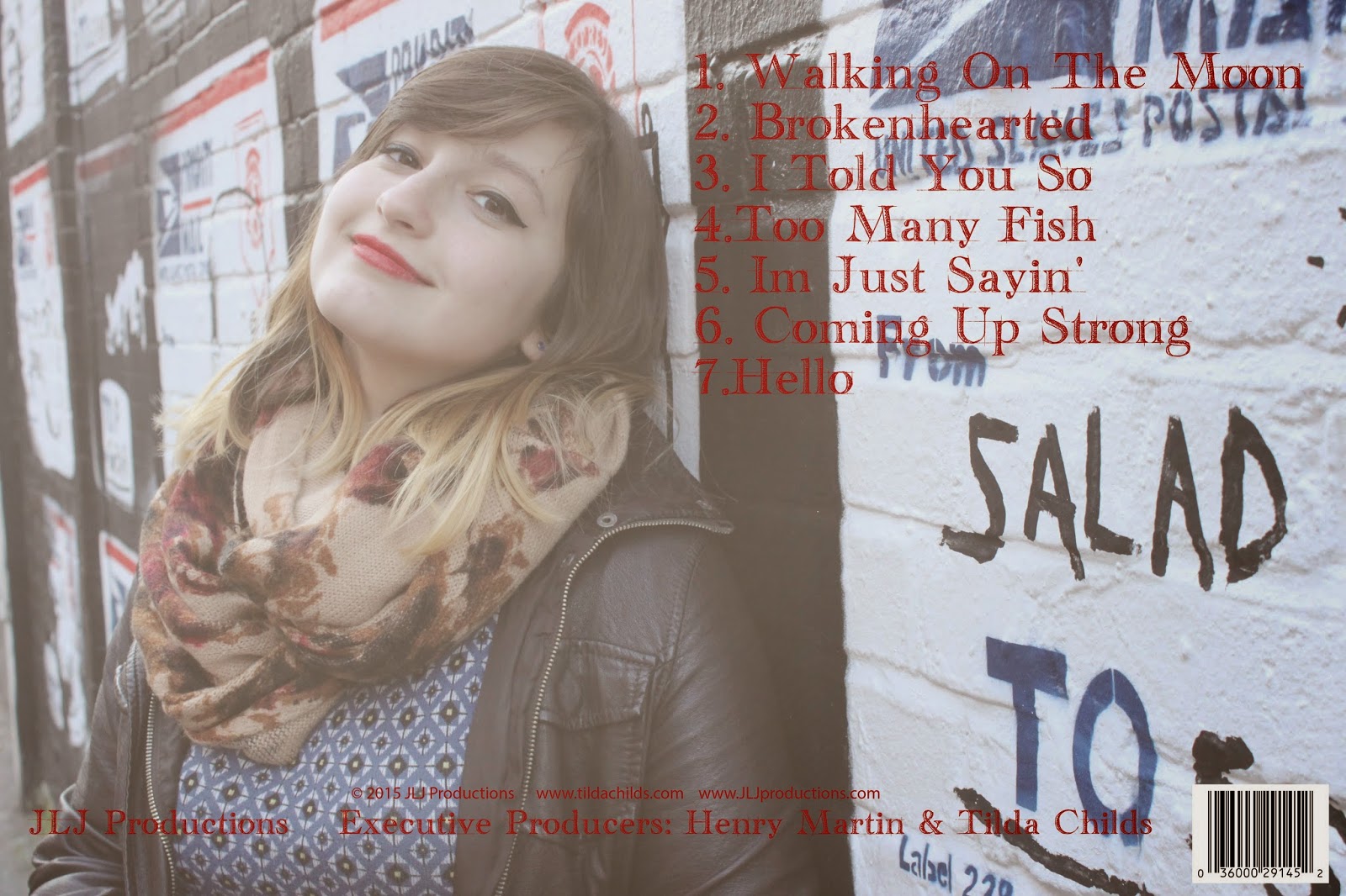
My final design for the back cover is a little simple in comparison to the front cover but it still relates as I have used the same colour for the font (red). The track list is also in simple font as when I researched digipaks I found that the back of the artists albums had very simple font for the track list as it is easy for the audience to read and is very clear. The back cover consists of everything a digipak is meant to, it includes a barcode, the recording company and the producers. I faded the original picture to make the font and track list clearer to the audience but to also give that sense of mystery so again keeping the theme with the front cover
No comments:
Post a Comment