Saturday, 28 February 2015

Digipak Research - Katy Perry 'Teenage Dream'


FRONT

This digipak has bright colours on the front this is to let the audience know that the album songs will create a feeling a fun and will be light hearted. The pink clouds make the audience think on candy floss which is associated with theme parks, rides and having fun so this could be a sign of what the album is like.There is no writing on the front cover as Katy Perry is a big enough star and instantly recognisable. The artist in pictured centrally on the digipak looking like she has no clothes on and her facial expression is seductive which means that they are using sex appeal to sell the CD they sex appeal is mainly used to draw in male audience.


BACK
The background is exactly the same as the front cover picture however it is just split down the middle, the digipak has the same theme throughout. The track list is written in bold red writing which is clearly visible to the eye, the font colour is used as red is a bright colour and a colour we associate with 'sweets' which seems to be the theme of the album. The barcode is included along with the record label and producers of the songs.
 
 
Both discs are also very colourful with one looking like a doughnut and the other looking like a candy cane so they are sticking with the sweet theme. Inside the album there is a panel where the CD clicks into, the cover inside as the artist posing with two cakes so again using the sweet theme this is a good way to attract her fans as a lot of her fans are young children who enjoy eating sweets so they associate the enjoyment of sweets with the album

Digipak Research - Meghan Trainor 'Title'

FRONT

A close up of Meghan's face is placed in the centre of the digipak which immediately draws the audiences attention completely onto her. The triangular pattern has been used to make the cover unique and memorable to the audience it also shows that the songs on the album will be different like the front cover, the colours used are light girly colours showing that the album will be fun to listen to and that her target audience are teenage girls. The artists name and the title of the album is clearly printed at the bottom in white writing and clear font so the reader can see it.


Meghan Trainor


BACK

The back of the digipak has a large image of the artist in the centre of it, this is so the audience focuses immediately to the album, he facial expression is fun and happy and she is looking straight toward the audience which makes a connection between the artist and the fans, the theme of the colours have stayed the same, the font for the track list is very simple and clear but the colour alternates suggesting the songs are all different. The barcode is placed on the side of the album along with the record label and the producers.


The colour of the cd is the same as the front and back , the colour is light to give off a feeling that the album is going to create a feeling of happiness. The inside cover includes a plastic section where the cd clips in which is what a typical digipak would include. Behind the cd panel is another picture of the artist in the centre, she is surrounded by a triangular pattern similar to the one on the front but smaller, this shows that the cd sticks with a consistent theme throughout and doesn't change it to drastically.


Friday, 27 February 2015

Digipak Research - Taylor Swift '1989'


                                                                           FRONT

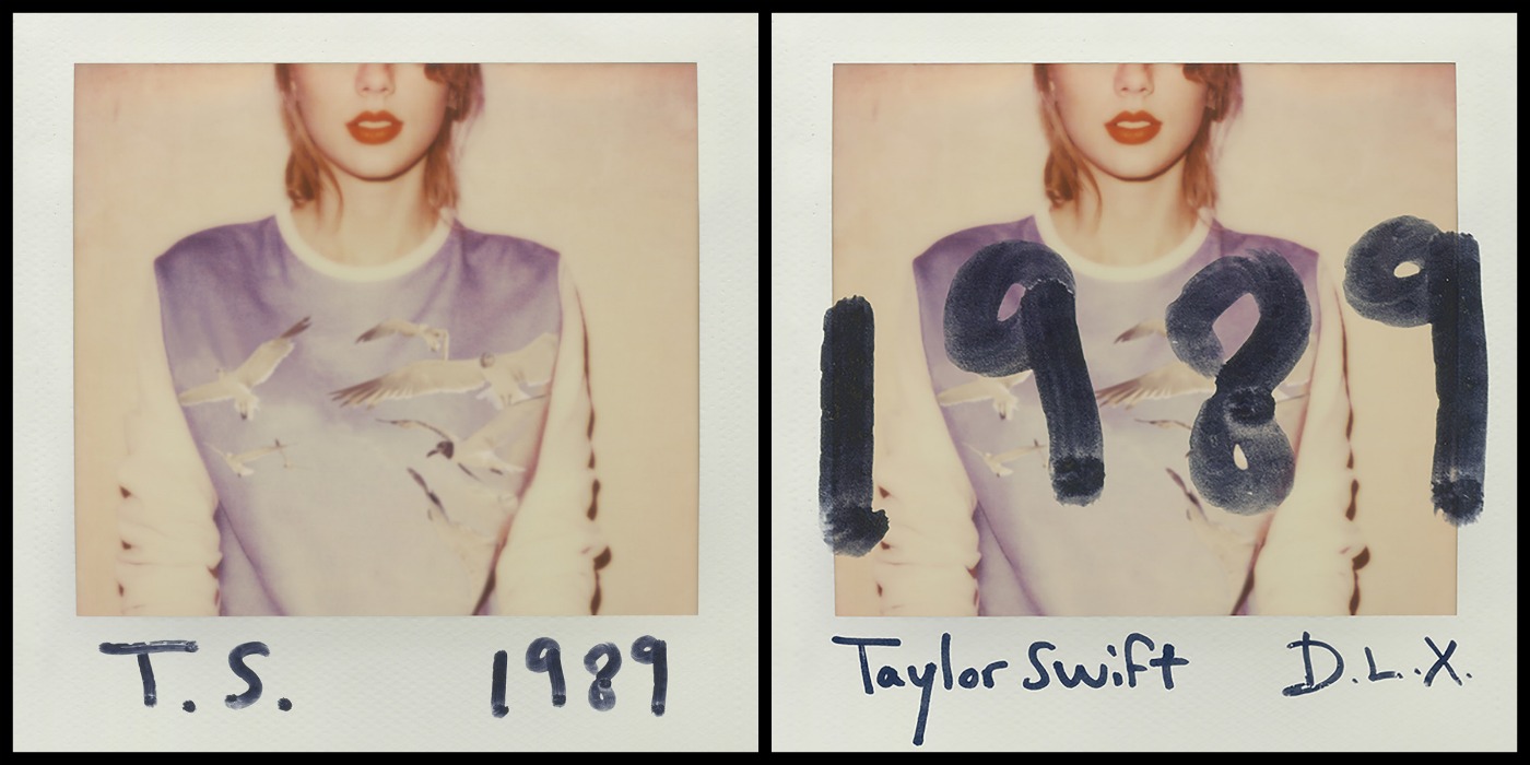
 The front cover is made to look like a polaroid picture of Taylor, the image in the centre of the digipak is of Taylor, her face is cut of half way so we cannot see her eyes this makes it intriguing to the audience and it gives a sense of mystery. The colours used are light which tells us the album songs are going to give a feeling of happiness. She is wearing red lipstick which she always wears so her fans can identify her and still relate to her as they cant look into her eyes to connect. 

The artists name is clearly written below the image and alongside it is the title of the album, the font makes it look like Taylor herself has personally signed it which instantly connects her to her fans and draws the audience in. On the right hand side of the picture is the deluxe edition of the album, the theme is the same however the design is slightly different, the title is much bolder and printed across the central image, this is to draw more attention as the deluxe edition offers more songs than the original.


BACK
On the back is another image placed  in the centre of the digipak, seems to have the rest of the picture that has been cut off at the front. The tack list  is more the focused as the numbers are in a bold font which draws the audience to immediately read the songs. The actual song titles are in a more simple, clear font to make it easy for the reader to see The barcode is placed at the bottom of the digipak  and alongside is the executive producers, also included is the year the album was made and the record label. The record label looks like it has been written by Taylor and gives a fun personal feeling to the audience. On the spine the artists name and the title of the album is also included as well as the record label
Taylor Swift - 1989 (2014) CD Back cover


INSIDE COVER
The inside includes pictures on both sides of the digipak, on the left in another polaroid picture so they theme is continuous, and again its giving that personal touch to it which makes the connection with the fans much stronger, behind the cd case is a image of birds in the sky, this gives off a relaxed happy feeling. The album as a whole looks like Taylor has had a big impact in the making of it and has put a lot of effort into making it personal for her fans to connect with


Digipak Research - Nicki Minaj 'The Pinkprint'


FRONT
nicki-minaj-the-pinkprint-cover-tracklist


The background of the front cover is completely black which draws attention  to the audience as it is bold and stands out, it is not a typical album cover as it is very simple and doesn't have the artist on the front. The image in the middle is in relation to the title of the album 'The Pinkprint', using the black background makes the image in the centre stand out more which draws our attention. There is no title on the album which is very rare in album covers, however the image explains the title very well, so the title is essentially there but without the words


The Digipak is kept very simple throughout, and the whole
artwork of the album matches. Keeping the album so simple
attracts the audience as they are endeared by this as the album
is a mystery in terms of the sound.


Nicki Minaj - The Pinkprint (2014) CD Back cover


The back of the Digipak is similar in terms of background and colours, so the theme is continuous, it includes the title of the album in words and italic like writing telling the audience that the songs included are various types of genres, it includes the track list of each song and the font has changes to simple so it makes it easier for the audience to clearly see the songs. At the bottom half of the digipak the barcode and executive producers are included with also the record label and the year it was made.
On the spine the artists name is included along with the title of the album which is typical for a digipak.

This album works because Nicki Minaj is a international popstar and everyone knows who she is


Codes and Conventions Of Digipak

Codes and Conventions

  • The inner packaging for a digipak is usually made out of plastic but you can get some made from cardboard
  • The outer packaging is made from card or paper with some design on the front
  • They are mostly used for albums
  • They normally fold into a square with the CD in the centre but there are many different types of folds for digipaks and they can have various panels
Front Cover
  • The front on the CD is used for promotion, 
  •  include the artists name
  • title of the album,
  • some may have a picture of the artist 
  •  some may have it simple with a design or colour

Back Cover
  • The back of the CD will have a similar template to the front, it will include the title of each song included, it will have a barcode usually at the bottom but sometimes it is on the side or at the top, it will include the record label and the year that the album was produced, on the back of some Digipaks it will have the producers and co- writers of the songs in small print
  • The spine on a digipak will include the artists name or the album name with the record label

Inside Cover
  • Inside there will be a plastic holder for the CD itself to click into
  • Behind the plastic where the CD clicks into will be a picture/design similar to the album
  • Some albums will include a booklet with the lyrics to each song inside and include the writes/producers to the song
  • It will include information about the artist
  • Personal messages from the artist

Thursday, 26 February 2015

Digipak Templates

 
    Digipak
 
 
There are various templates of a typical digipak, there are 4 panel. 6 panel and 8 panel. I have decided to either use a 4panel or 6 panel digipak. I will use either the 6 panel digipak with the CD placed in the centre or the 4 panel digipak with the CD placed in the inside right.