- What genre of music do you like
- List some of your favourite music videos
- What do you like about these videos
- What score would you give our idea
- What features would you like to see in our video
Tuesday, 14 April 2015
Audience Feedback
For our audience feedback we created a questionnaire to find out what things make a good music video to them and what they think a pop music video included. The questions we included were
Monday, 13 April 2015
Digipak
The spine of the digipak is again a continuous theme to the front cover, it is the same picture as the front cover and again the pink colours represent what the song in our music video is about. I have included the artists name and the recording company so the audience are able to read it with ease.
The CD I designed is a simple but bold look, i decided to put red lips on the cd as it is our artists trademark and star image. This again hints at the audience what they can identify and remember the artist for. The colour is also sticking with the theme of the digipak and the song theme.
Digipak
Back Cover
My final design for the back cover is a little simple in comparison to the front cover but it still relates as I have used the same colour for the font (red). The track list is also in simple font as when I researched digipaks I found that the back of the artists albums had very simple font for the track list as it is easy for the audience to read and is very clear. The back cover consists of everything a digipak is meant to, it includes a barcode, the recording company and the producers. I faded the original picture to make the font and track list clearer to the audience but to also give that sense of mystery so again keeping the theme with the front cover
Digipak
Front Cover
My final digipak front cover design is based on showing the bright colours and the lipstick the artist is wearing to make her identifiable with the audience. I used this image to create a sense of mystery within the artist as to what can be expected from the album. I made the red and pink colours brighter to make them stand out and to show that the colours are in relation to the song which is about heartbreak and love which these colours represent
Monday, 30 March 2015
2nd Set of Audience Feedback
After making imporvements from our first feedback we then had another rough cut to show and we got some more feedback. From this we learnt that
- camera shots/angles were very good
- graphics really interesting and impressive
- the narrative is more clear
- some shots still a bit too long
- more variety of shots
Tuesday, 17 March 2015
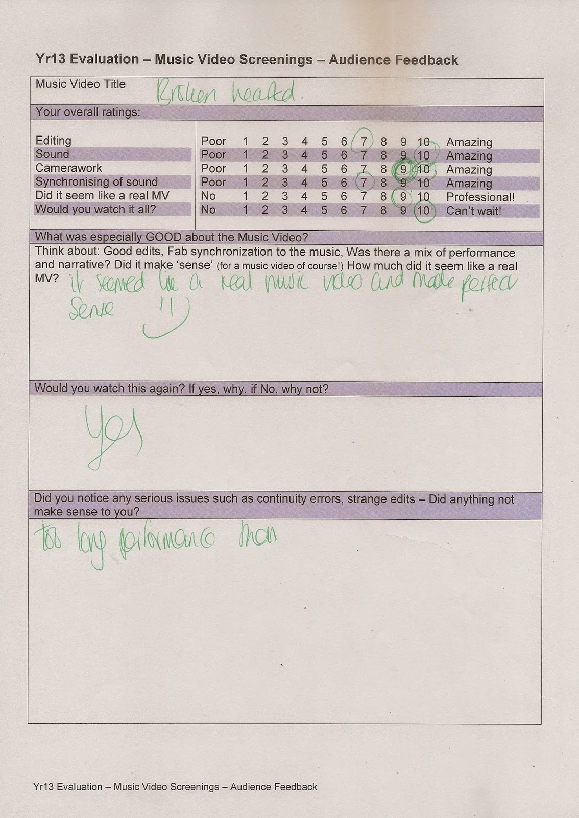
1ST Set of Audience Feedback
By looking at this feedback we found that the postives were
- The special effects we used were good
- Our narrative was good and interesting
- we used various locations in which people liked
- Our shots were too long in some places
- Some scenes were not in sync
- The café scene didn't make sense to some people
Friday, 13 March 2015
Website Research
As soon as you click onto Rudimental website all that comes up is there name with tabs running along underneath it. The tabs include news/blog, live, videos , music and store, along side the tabs they have links to all social media such as Spotify and sound cloud which lets the fans access their music and links to twitter and Facebook to allow fans to communicate with the band and follow their movements. Along the bottom they have a tab to allow fans to sign up to the site to receive emails about Rudimental.
The news/blog tab shows where they will be performing and on what dates and also lets you see what Rudimental and their fans have been saying. Clicking on the Live tab allows fans to buy tickets for upcoming performances and diverts you to a ticket site, on the videos tab fans are able to view all the videos they have made and also the most recent one so they are promoting it. The music tab allows fan to listen to music they have released.
The store tab takes you onto another page and the style of the page is consisitent with the home page as it is staying with the similar colours and fonts. The merchandise they offer are clothing and accessories such as bags, there are no pictures of rudimental or information about them this may be because there are a band that are more focused on the music rather than a 'brand' like other artists such as pop artists. The navigation is easy and simple to use however it seems a bit to simple
Subscribe to:
Posts (Atom)